Wednesday, April 23, 2025

Where Do Artists Get Their Ideas?

Years ago, I helped to design an online class for which I wrote some material on how artists get ideas - especially for creating images from imagination. Below, I have rewritten some of that material and added more recent sketches to illustrate my process for “ideation” -- the exploration and development of ideas.

So... where do artists get their ideas? Many great minds have attempted to address this question, yet definitive answers elude us - the late Harlan Ellison hilariously claimed to use an idea service in Schenectady. But seriously, there are techniques that can help you find and develop your own ideas. Below are some of my suggestions for ideation.


The Act of Sketching

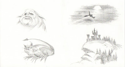
Ideas may begin with doodles in sketchbooks, on pieces of typing paper, or even on a napkin in a restaurant. When sketching, let your imagination run wild. Sketch out any idea, no matter how crazy. You can decide later what works and what doesn't. Keep sketches very rough and loose. You might have many false starts before finding something that works. The important thing to understand is that the very act of sketching itself can generate new ideas. There may be a universe of new ideas out there waiting to be discovered, but you will never find them until you set pencil to paper and explore. Below are some doodles from my sketchbooks. These are quite rough and crude, but this is how many of my ideas often start.

Thomas Starnes imagination sketches
Thomas Starnes idea for comic book layout
Thomas Starnes character designs
Thomas Starnes developing a comic book page
Thomas Starnes exploring composition
Thomas Starnes explorative designs
Thomas Starnes ideas for spacecraft
Thomas Starnes page layouts
Thomas Starnes exploring concept design
Thomas Starnes page layout ideation
Thomas Starnes page layout based on 5pt grid
Thomas Starnes concept for futuristic observatory
See more of my sketches from imagination here.


Finding Order in Chaos

Have you ever looked at clouds and imagined faces in them? Our imaginations have an amazing capacity to find order in chaos. Visualizing things in random shapes is another technique for generating ideas. Try sketching random lines and shapes on paper, and then try to "see" creatures or landscapes within them.

Start with random lines and shapes
simple lines by Thomas Starnes
Now try to develop something from your random shapes
Thomas Starnes ideation process


Ideas That Don't Work

If your sketching doesn't seem to be leading anywhere, don't get frustrated. Sometimes ideas that don't work will lead to ideas that do. In designing Russia for the Reversed Front: Bonfire game, my initial sketches featured a cityscape with Soviet architecture, but it felt like something was missing. These just weren't working for me.

Thomas Starnes concepts for Russia

In playing around with the Steampunk elements, I stumbled onto the idea of using spider-like shapes, and the environment design really took off from there. In terms of concept, I think this turned into one of my more successful ideas for the Reversed Front Game (see the finished version of Russia here). It just needed the right twist, but I don't think I could have arrived at the final result without working through the early less-successful stages.

Thomas Starnes color study


Feeding Your Imagination

In my opinion, one of the best efforts to explain the genesis of ideas can be found in Alan Moore’s essay on writing comics. I won’t restate his words here (but I highly recommend you read his essay for yourself). I’ll just give my own spin on Moore’s advice: ideas seem to happen at an intersection where the objective world around you collides with your own subjective or emotional responses to the world. Each of us has our own unique inner response to life, but we also need broader life experience to fertilize our imaginations so that our ideas can grow. In years past, I have advised students to feed their imaginations by doing research and finding references, by visiting libraries and bookstores; you might read or see something that inspires you, perhaps something that leads you to more ideas (or better ideas). Also visit museums, zoos, historic sites, or places with interesting views and architecture. These places are gold mines of inspiration for artists. Take along a sketchbook and a camera to record your impressions, as well as details that may be useful as reference later. Above all, go out and experience the world for yourself. I believe that research, reference, and life experience provide raw fuel on which imagination runs.


Thursday, April 17, 2025

A Necessarily Incomplete List of Artistic Influences


Ink drawing of ghoul sitting at typewriter, surrounded by papers and a skull candle
Ink drawing by Frank Frazetta

Art students sometimes ask me about my artistic influences (i.e.: which artists have most influenced me), and also which artists I would recommend for aspiring artists to study (or look to for inspiration). It’s very difficult to even put together such lists, because there are just too many names. The list below is doomed to incompletion, and the omission of any artist should not be taken as a sign that I don’t hold said artist in high esteem. At very least, this list may serve as a starting point for anyone looking for inspiration. Also, these names are not in any particular order, but it's safe to say these are my biggest artistic influences. 


Early Illustrators (or "Golden Age Illustrators", 19th Century through mid 20th Century)

  • Franklin Booth
  • Charles Dana Gibson
  • Alphonse Mucha
  • J.C. Leyendecker
  • Dean Cornwell
  • Robert McGinnis
  • Albert Dorne
  • James Bama
  • Normal Rockwell


More Recent Illustrators (mid to late 20th Century forward)

  • Syd Mead
  • Frank Frazetta
  • Drew Struzan
  • Iain Mccaig
  • Thomas Blackshear


Illustrators who wrote influential books/materials on drawing:

  • Andrew Loomis
  • Arthur Guptill
  • Robert Fawcett
  • James Gurney
  • Jeff Watts (not so much his books, but his online atelier program and video lectures)


Comic Book/Comic Strip Artists (some of these were illustrators but I place them in this category because their comic work/inking technique influenced me more than their illustration work)

  • Alex Raymond
  • Hal Foster
  • John Buscema
  • Wally Wood
  • Bernie Wrightson
  • Al Williamson
  • Alex Toth
  • Alex Nino


Artists/Painters (this list is woefully incomplete, but these names first come to mind as having had the biggest impact on me over the years).

  • William-Adolphe Bouguereau
  • Nicolia Fechin
  • Ilya Repin
  • Jean-Baptiste Greuze
  • Diego Velasquez
  • John Singer Sargent
  • Michelangelo
  • Leonardo da Vinci
  • Gian Lorenzo Bernini


Again, this list is very incomplete, and very likely, I will revise it at some point, but for now (off the top of my head) these names have been the biggest influences on how I draw, and how I think about art.

Friday, April 11, 2025

Eye Update

This is an eye update for almost  months post DMEK cornea transplant surgery on my left eye (see my previous posts about my experience with Fuchs Dystrophy and DMEK here and here). I have attempted to show my current state of vision with this diagram. Vision in my left eye is dramatically improved, but I still have a slight double vision effect. Otherwise, I am able to see details and textures that I have not seen in quite a few years. Colors are brighter and more vivid. My right eye has not yet had cornea transplant, so vision remains blurred, with images fading out as illustrated on the right side in this diagram.

Diagram comparing visual acuity in left and right eyes

I am able to read fine print again without resorting to a magnifier. Also, I am getting back to drawing on actual paper (as opposed to drawing on a Wacom screen where I can enlarge everything 200x).  I am absolutely thrilled to be getting back to things which I had to set aside as the Fuchs Dystrophy progressed. However, my left eye is doing all of the work right now, and I still get this haze coming in from my right side. I look forward to the second cornea transplant which is scheduled for next month.

Wednesday, April 9, 2025

“To Z, with Love”

[with apologies to James Clavell for stealing his title of the wonderful 1967 film: “To Sir, with Love”]

Professor Frank Zamora, affectionately known to his students as "Mr. Z", taught art at the college level for over four decades. I enrolled in his Pen & Ink class at Sacramento City College (SCC) in 1992, and we have kept in touch off and on almost every since – making Mr. Z the one professor with whom I have kept in touch longer than any other. Mr. Z was by far the most inspiring instructor at SCC. Where other instructors might talk about drawing principles, Mr. Z actually demonstrated drawing principles with inspiring demos and infectious enthusiasm for art.

Illustration of art teacher with every drawing tool imaginable

Pencil drawing for the above illustration

I made this caricature as homage to Mr. Z’s methods. Since he is known for his "mixed media" techniques,I depicted him with every art tool but the kitchen sink (though he could probably find a way to use that too). I was aiming to capture something of Mr. Z's blend of academic drawing principles with "improvised chaos".

The drawing for this illustration was executed in graphite on Strathmore Water-Media board. For the painting, I tried to use most of the tools Mr. Z might use: splatter brush, stippling, razor blades, spritzer bottles, toothbrush, palette knife, color pencils, pastels, acrylic paint, gouache, ink, fingers and thumbs... (I am probably forgetting a few things).

I did not fully achieve the abstract-expressionist approach I was going for in the background, but I would like to think it evolved not unlike how Mr. Z's work develops - it's an organic process and you can't really predict the final results. Hopefully this pays homage to my teacher who inspired me so many years ago, and continues to inspire me today.

Saturday, April 5, 2025

Reversed Front Bonfire Video Game Released Today

Illustration of imaginary Russian city with spider-like steampunk shapes
 
On this day, after many delays, the Reversed Front Bonfire video game is finally available to download from the App Store and Google Play. I was honored with the opportunity to design a bunch of environments for this game. Above is my work on the environment representing Russia. I am also including the earlier stages of this environment design below: the line drawing and the tonal rendering.

Initial drawing of Russia by Thomas Starnes
Adding value (tone) to the line drawing

You can read about my process for designing and painting the backgrounds for Reversed Front on my website here.  The Reversed Front game has been heavily suppressed by the government of Communist China, but you can help by downloading the game (it's free).

Thursday, April 3, 2025

Kenneth Potter and the California Style - Part III

[This post is the last in my series on Ken Potter, his impact on my life, as well as the California Style of watercolor painting.]

Recently I have been rereading Ken’s letters, and contemplating the advice he gave to my younger self (then at the beginning of my art career). His letters were always hand-written, sometimes inside a card printed with one his beautiful watercolors, like the example below.

The front of Ken's card

Letter inside card addressed to Thomas Starnes

In many ways, Ken and I were opposites: he lived in the moment, and his work was all about spontaneity and improvisation. "Bold and free, Bold and free!" he shouted over my shoulder as I worked nervously at my easel, agonizing over every detail with ooh-too-much care. "Precision-ism" is what he called my work. He said I was becoming a "Precisionist" who created "colored drawings" rather than "paintings". His point was valid; the truth is I liked to draw more than I liked to paint, and my paintings tended to be overworked. I was never able to be naturally spontaneous. Ken was a proponent of the “California Style”, or “California School” of watercolor painting, which emphasized bold brushwork and bright transparent colors. Ken’s version of the California Style, which he sometimes referred to as “Watercolor Expressionism*”, emphasized an extemporaneous spur-of-the-moment approach, flinging paint across the stretched watercolor paper, letting it land where it may, and responding to the paint the way an improvisational jazz musician responded to the music. In contrast, I had become enamored with classical art training, especially the atelier approach to art education, where I spent many hours meticulously rendering every detail of a plaster cast or figure study. As artists, Ken and I were like two different species of animals.

I have very high regard for the California Style of watercolor painting, and especially Ken’s version of it. I admire the bold, loose brushwork; I envy the ability to be spontaneous. But in the end, I took a different direction. I think Ken was disappointed, especially with the commercial emphasis of my work. He told me, “There is nothing wrong with being a commercial artist”, but I sense he would have liked to see me pursue a different direction. Nevertheless, I am grateful for Ken Potter and his advice to me; he set a very high bar and taught me respect for the craft.

Ken spoke of the suppression of Regionalist painting, and I was too naïve at the time to understand the politics of the art world. Now I understand that the California Style was a type of Regionalist painting, which was perhaps seen as a rejection of Modernist trends, hence it may have been overlooked by mid-20th century academia. Fortunately, recent generations of art historians are recognizing the contributions of the Regionalist painters. There is a good history of the California Style of Watercolor here and here. Also, I recommend Gordon McClelland’s books (here and here). Finally, below is a rare video which was recorded by Frank Zamora, featuring Ken at work.


*Ken sent me a typed paper entitled “Watercolor Expressionism”, from a lecture he gave at the Palos Verdes Art Center in 1991. In the paper, he set down his ideas on painting. I doubt Ken ever used a word processor (which was relatively new technology at the time), and his typed paper contained various handwritten corrections/revisions. I think his ideas were probably more fully developed within the pages of the McClelland’s book (especially see “Chapter 4: Art Creation and Personal Reflections”).

Tuesday, April 1, 2025

Kenneth Potter and the California Style - Part II

Ken's postcard with one of his paintings on front

"Nevada City Classic", by Kenneth Potter, exemplifies the California Style or California School of Watercolor painting, with its bold brushwork, its spontaneous application of bright vivid but transparent color, and its depiction of a local, small-town scene painted on-location, typical of the American Regionalist movement (of which the California Style is a part). This painting was printed on a postcard which Ken mailed to me in 1996, following a somewhat challenging interaction, as I describe below:

After I had been studying at the Academy of Art in San Francisco for a few years, I let Ken know that would be returning to Sacramento for Christmas break. Ken invited me over to his house, suggesting that I bring my recent work so he could see how I was progressing. I brought over a couple portfolios of drawings and illustrations, as well as an armful of paintings on canvas, and laid them out on Ken’s living room floor. Oh, the look on his face! Ken was so disappointed and let me know it in no uncertain terms. We spent about 3 hours discussing everything that was wrong with my work. What had I been doing with my time?!? The truth is that I had been working very hard, drawing and painting every day, late into the nights. In the eyes of my classmates, I was making fine progress, but by Ken's standards, I was spinning my wheels and burning up lots of energy to go nowhere. Ken had studied at the Academy of Art in San Francisco for all of 2 semesters, basically learned everything he needed to learn in that time, and proceeded to support himself by selling his paintings. He was flabbergasted that I was still struggling with painting technique after a couple of years. He just shook his head and looked terribly disappointed. I went home feeling very depressed.

Somehow, I managed to recover. Upon graduation from the Academy of Art, my drawings were winning awards and I was hired by Walt Disney Feature Animation. At that time, Ken said that my work had achieved a kind of “verve” and "soul", especially in the portraits. He seemed pleased when I told him that I put up images of his paintings around my desk at Disney to keep me inspired while working on animation.

Ken and I continued to correspond on and off for some years. Regrettably I lost touch due to moving from place to place and battling deadlines. But I treasure his letters, which were always handwritten, sometimes on a few pages of note paper, sometimes on the back of a postcard printed with one of his paintings (like the "Nevada City Classic" shown above).  On the back of this particular postcard, he admonished me with this advice: “‘We musn’t concern ourselves with who is better than another, so much as who is honest’. We are indeed each unique and we should strive to express that which is nearest to our understanding… which is following our passion!”  I have never forgotten this advice (although I regret that I have not always applied it in my life).

Back of Ken's postcard

I will have some additional thoughts on Ken Potter and the California Style of watercolor painting in another post on this blog.